

Use our interactive map to see how long people went without electricity, food, shelter, money and other essentials after California's historic wildfires in 2017-2019
Where our data comes from
In early 2018, Dr. Irva Hertz-Picciotto and the UC Davis Environmental Health Sciences Center (EHSC) began conducting the California Wildfire and Health Impacts Survey as part of a larger research project, “Wildfires and Health: Assessing the Toll in NOrthWest California” (WHAT NOW California). The data for the map below came from several rounds of surveys that encompassed 1,887 households and represented some 5,345 people and their experiences across the 2017 and 2018 fire seasons. Researchers also collected data from the Kincade Fire in Sonoma County, which burned 77,000 acres and destroyed 374 structures over 13 days in October 2019.
While wildfires have long been a part of California’s landscape, these new urban wildfires mark a turning point in our understanding of the impact climate change is having on people and their communities. The goals of the project were to:
- Understand the experiences, injuries and traumatic events that occurred during and after wildfires
- Assist county health departments, other agencies, medical providers, policy makers and non-profit organizations by providing data on the types of needs of survivors and on ways they may be able to plan for future similar events
- Identify short-term physical and mental health effects in survivors residing in California, along with urgent needs that residents have
How to explore the map
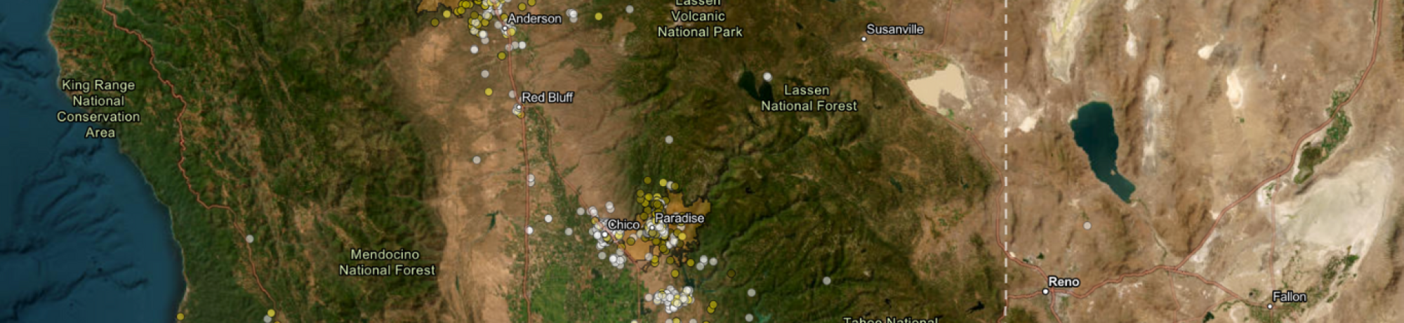
The map focuses primarily on analyzing needs-related data. All points on the maps represent households, which have been scrambled to preserve anonymity.
In order to help county health departments, agencies, medical providers, policy makers and non-profits, we coded a series of variables to see if there was clustering of needs for any of them (food, water, shelter, etc.). Each map displays how long households reported being without that need.
The legend
The legend shows data related to different wildfire survivors’ needs: cell phone, electricity, shelter, internet, money, transportation, clothing, food and water. The 2017, 2018 and 2019 Kincade fire perimeters are visible (in yellow) as well as county outlines for easy navigation. To get to the legend, click on the double arrows on the top left side of the map.
Once in the legend, you can click on the box for the data you would like to see. Each need is color coded so the darker it is the longer people went without it.
- You can see the color codes and durations by clicking the arrow to the right of each need.
- You can click on more than one need at a time to see multiple data points on the map.
- If you don’t click on any needs, you’ll see Northern California counties and where the 2017, 2018 and 2019 Kincade wildfires took place.
The view
You can explore different areas of the map by pressing and holding your cursor to the spot you would like to see. You can also use the arrows on your keyboard to navigate on the map. Below the double arrows, click plus (+) to zoom in or minus (-) to zoom out. Click on the home icon to zoom back to the original view.
Click on the basemap icon (the group of four small squares) to select different map backgrounds: default, hybrid, streets day or night, topographic or navigation. To view a larger image, click on “view larger map” at the bottom of the legend, which will open a larger map in a new tab on your browser.
Don’t worry! No one can find your house with this map. To protect research data and participant anonymity, we designed the map so no one can get a street level view.
Click inside a county to see its name, how large it is and other important information that can help you understand the impact wildfires have had on people and their communities.
The wildfire map